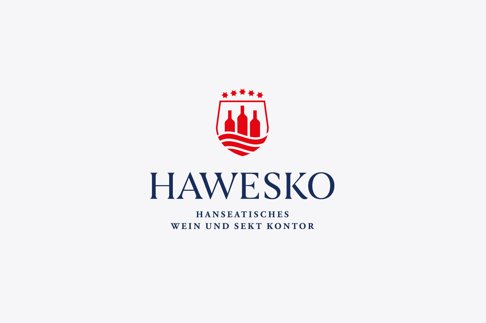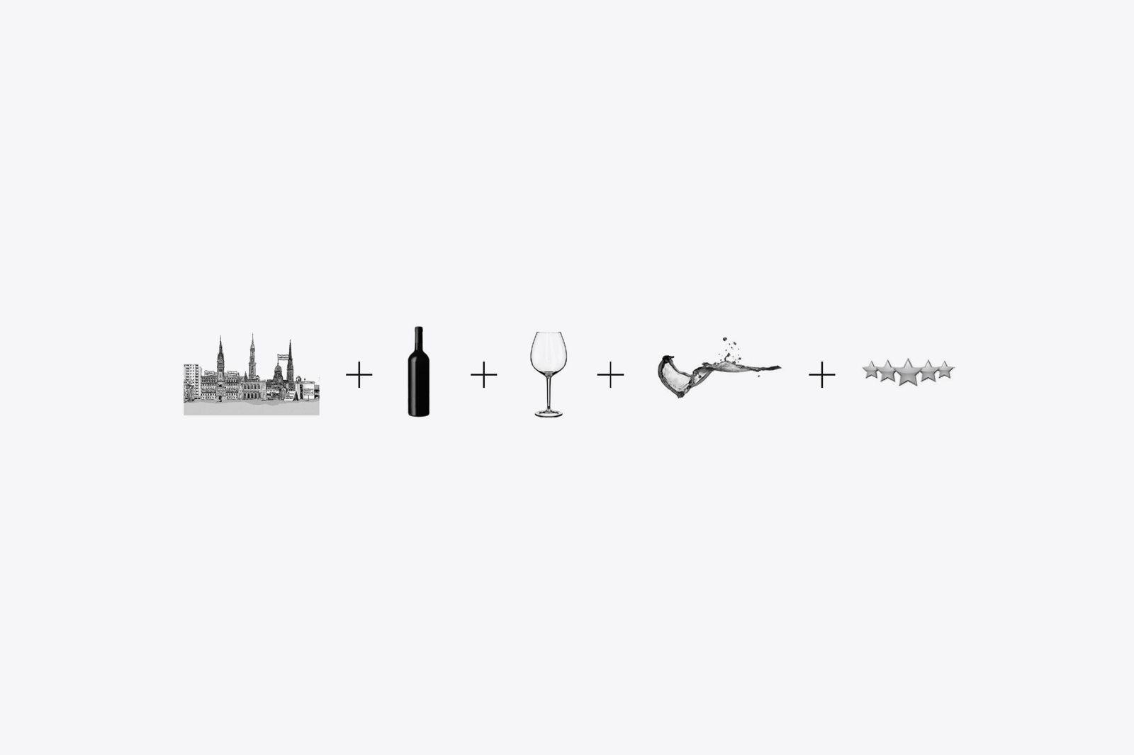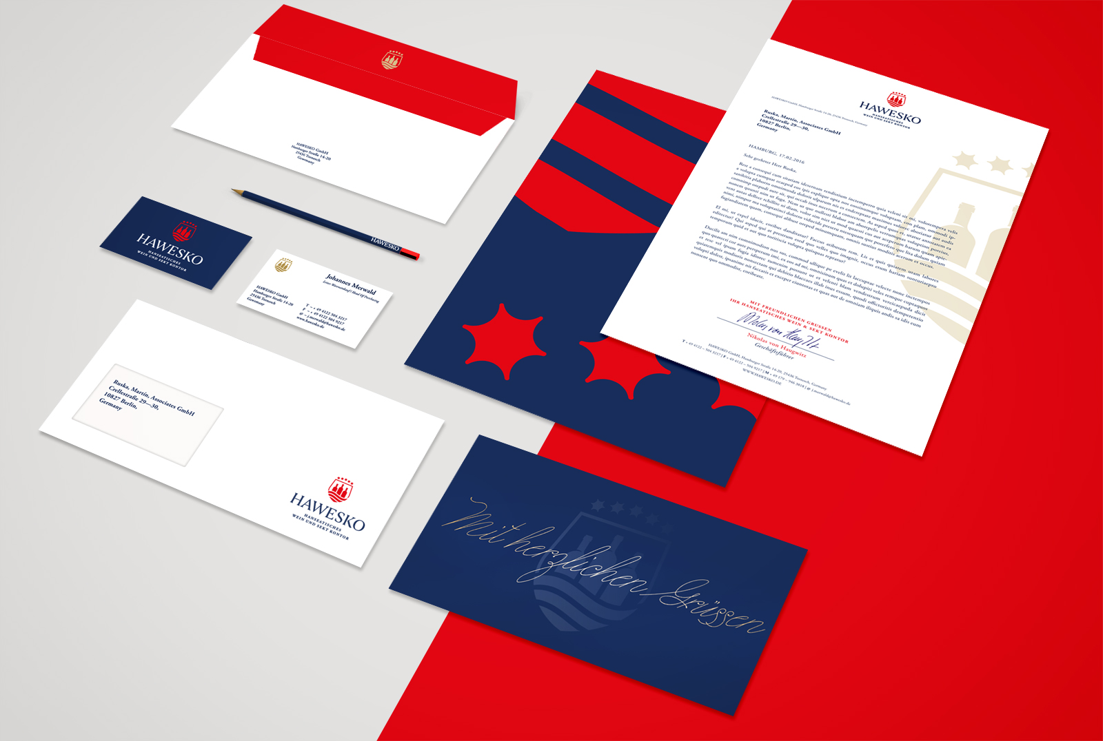


New Logo and corporate identity proposal for Hawesko, Das Hanseatische Wein & Sekt Kontor. The Hawesko Group is Germany’s largest integrated merchant for premium wines and champagnes, and one of the leading sellers of wine in the world. The new logo had to represent Hamburg and the wine world. Inspired by the skyline from Hamburg with their 3 biggest towers and the red color of the turist brand the result shows a shield made with a glass shape where the bottles comes up from a wine sea. The navy blue fix to represent the maritim spirit of the city.